Images from court opinion
You can copyright just about any design, right? Not quite.
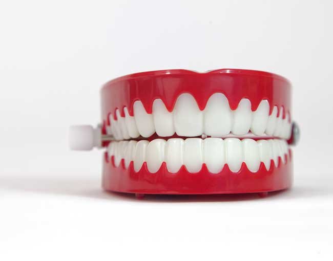
Those who think there are no teeth in copyright law’s originality requirement only need to look at Dr. Mitchell Pohl’s before-and-after photos portraying his cosmetic dental work. Dr. Pohl sued a competitor he found using his photos, but the competitor claimed the photos weren’t original enough for copyright.
The court agreed in Pohl v. MH SUB I, LLC, finding that Dr. Pohl’s two “direct shots” of his patient’s teeth were purely utilitarian, like pictures of food plates on a Chinese restaurant’s menu. They lacked the minimal required “creative spark.”
Photographs are often viewed as creative because of the photographer’s creative choices in angles, lighting, posing, and composition. But because Dr. Pohl couldn’t even remember the camera, the lighting, or whether the patient was sitting or standing, he made out a weak case for creative choices. To the court, the photos were merely functional: “To the extent he posed her for the camera, it was to tilt her head, lift her chin up or down, instruct her to smile, or to tell her to look at the camera.” In sum, “There is nothing remotely creative about taking close-up photographs of teeth.”
So what is sufficiently original for copyright? The Copyright Office has developed rules and guidelines concerning many common designs, such as designs involving common geometric shapes. In a seven-page ruling in January 2019, the office’s review board rejected registration of a set of toys made up of three-dimensional tiles, including triangles and squares of different sizes. Analyzed both separately (as simple shapes with solid coloration) and as a set, they lacked “adequate expressive content” or the required “modicum of creativity.”
A month earlier, the review board approved registration of another work made up of geometric shapes — a sculptural work consisting of two wooden platforms, an arch of tetrahedrons, and two trapezoidal boxes. The artist met the creativity threshold with a combination of multiple shapes into “a design that illustrates creative choice in the positioning of shapes in the overall Work.” But this work barely made it — the board cautioned that the copyright was “thin.”
For more information, there’s a chapter in the Copyright Office Compendium on this subject. Or you can just remember: “No way” for teeth or triangles; a thin “OK” for tetrahedrons.
Mark Sableman is a partner in Thompson Coburn’s Intellectual Property group.


